The 10 Best Practices for Creating a High-Converting Submission Form
A practical, no-nonsense framework for building streamlined, branded, creator-friendly entry forms in 10 easy steps.

Published on April 8, 2026
Reading time: ~8 minutes
Introduction
A submission form is not admin.
It's not a spreadsheet with better lighting.
It's the moment someone decides whether your opportunity feels worth their time.
If your form is bloated, confusing, or visually flat, strong candidates quietly abandon it. If it's clear, structured, and beautifully presented, completion rates rise — and so does the quality of work you receive.
This guide walks through how to streamline submission forms properly — without cutting corners or losing important information.
1: Start With the Decision You're Making
Before building your submission form, think about the outcome. What do you want to achieve?
- Selecting finalists?
- Choosing a winner?
- Allocating funding?
- Programming an exhibition?
- Choosing a piece to publish?
Your form should collect exactly the information required to make that decision — no more.
Too many awards and contests build forms by copying last year's version. Over time, fields accumulate. You end up asking for full biographies, marketing-ready summaries, high-res press images, multiple social media handles, and long diversity statements.
A streamlined submission form reduces friction. Friction kills completion rates.
If information can be collected later (e.g., press materials from finalists), then do this at a later stage of the submission cycle.
2: Ruthlessly Edit Your Questions
Every field must earn its place. Assess each one individually. Do we actually need that info? If not - cut it. If you're on the fence about whether to include a field, it's probably not good enough.
For each question, ask:
- Does this directly inform judging criteria?
- Is this essential at this stage?
- Could this be optional?
- Are we asking this out of habit?
- Did you see someone else ask for this on their form and think - it must be important?
- Are we asking this to sound like we know what we're doing?
Avoid:
- Duplicate data collection. Are we essentially asking the same thing in different fields?
- Open-ended questions where a structured response would suffice
- Vague prompts that lead to unusable answers
Strong forms use:
- Clear word limits
- Specific prompts
- Examples when helpful
- Concise language
Instead of "Tell us about your work," try "In 250 words, describe the concept behind the submitted work and how it relates to this year's theme."
Precision improves quality. Stress word limits and guide the applicant by using placeholder text. Applicants love placeholder text.
Here at Dapple, we have form versioning too. This means you can save multiple versions of the same form and switch to them at any point, even in the middle of a call or application cycle. This means that if you need to add or remove fields, you can do it easily and won't lose any data on those who have already applied.
3: Break Long Forms Into Logical Steps
A long scrollable page feels heavier than it actually is. An applicant might open your form, have a quick scroll, see the length and think - nope. If it's broken into sections, then you don't see the length and it's not as daunting.
Breaking your submission form into steps or sections:
- Reduces cognitive overload
- Improves form completion rates
- Creates a sense of progress
- Makes the process feel manageable
As a general rule of thumb, there tends to be 4 or 5 main sections:
Step 1 — Applicant Info
Contact details, portfolios, social media links and basic information about the person.
Step 2 — The Why
Why is it that person is applying. Why are they a good fit.
Step 3 — About the Work
Title, category, description.
Step 4 — Supporting Materials
Uploads, links, attachments.
Step 5 — Declarations & Payment
Permissions, AI disclosure, fees.
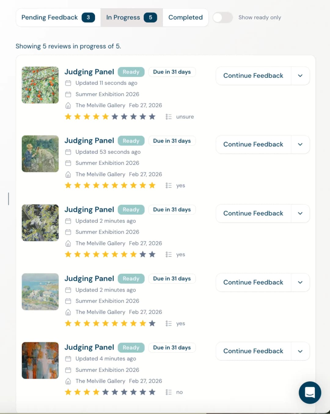
Segmenting forms isn't cosmetic. It changes behaviour. People are far more likely to complete something that feels structured. Dapple has a smart Step feature built in. You can easily segment fields into different steps which candidates can flick through, see their progress and visit every step individually. Nice.
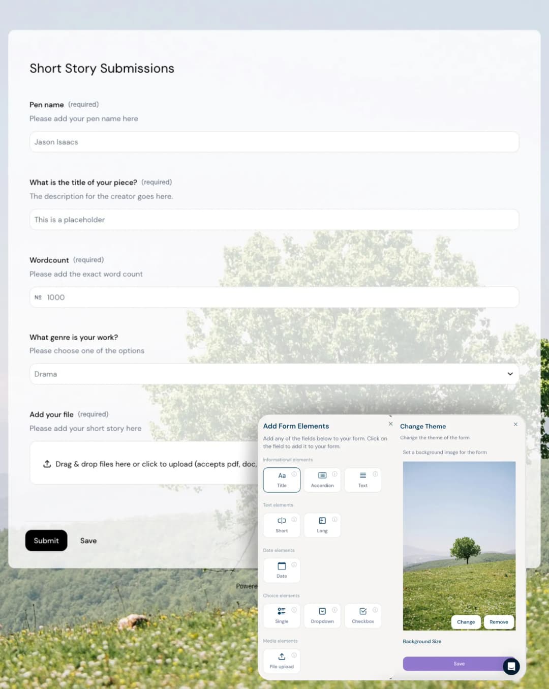
4: Use the Right Field Types
Poorly designed forms default to long text fields for everything. That's a mistake.
Choosing the correct input field:
- Reduces errors
- Improves reporting
- Speeds up completion
- Makes judging easier
Examples:
- Short text fields → Titles, names, locations
- Dropdowns → Categories, regions, disciplines
- Radio buttons → Single clear choice
- Checkboxes → Multi-select options
- File uploads → Creative work
- Payment baskets → Tiered entries
- Consent checkboxes → Rights confirmations
If you want to analyse submissions by discipline later, don't ask applicants to "type their discipline." Give them a controlled dropdown.
Structured data = smarter review process.
Using structured fields also helps with end data too, especially when exporting and working with data in spreadsheets.
5: Use Conditional Logic to Personalise the Experience
Conditional logic is one of the most underused tools in submission form design.
Instead of asking everyone everything, show fields only when relevant. This not only helps give a more personalised submission journey but also can help reduce the length of the form.
Take an awards for example where an entrant might have the opportunity to enter multiple times, each with supplementary materials and each entry for an extra cost. Without conditional logic, this form might be unnecessarily long with empty fields that don't apply to most people. Conditional logic here would enable those fields to be hidden, making the form much shorter and much more relevant.
Other examples could be:
- Selecting "Student" reveals institution field
- Choosing using number of entries to reveal the correct price
- Selecting multiple categories unlocks additional upload slots
- Answering "Other" and then specifying what "Other" entails
This does three things:
- Shortens the visible form
- Makes the experience feel tailored
- Reduces irrelevant data
From the applicant's perspective, it feels thoughtful. From your perspective, it keeps your dataset clean.
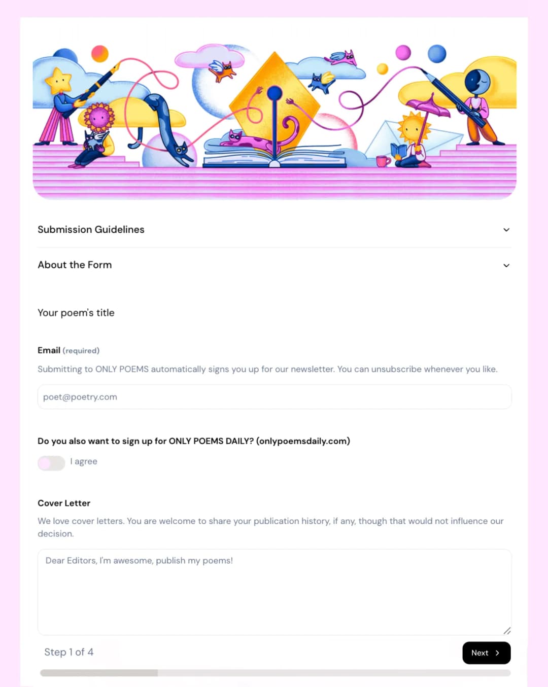
6: Design and Tone
For creative industries in particular, aesthetics matter.
Convey your brand, imagery and tone through your forms.
Your website might be fantastic. Your Instagram posts are great. Marketing emails professional. A potential applicant then gets to your form only to find something that looks dated or generic. It subtly communicates that your opportunity may be too.
Branding isn't decoration. It's reassurance.
Dapple allows you to add header images, change text, button and background colours, transparency levels and add background images. These can really bring your form to life from a design POV.
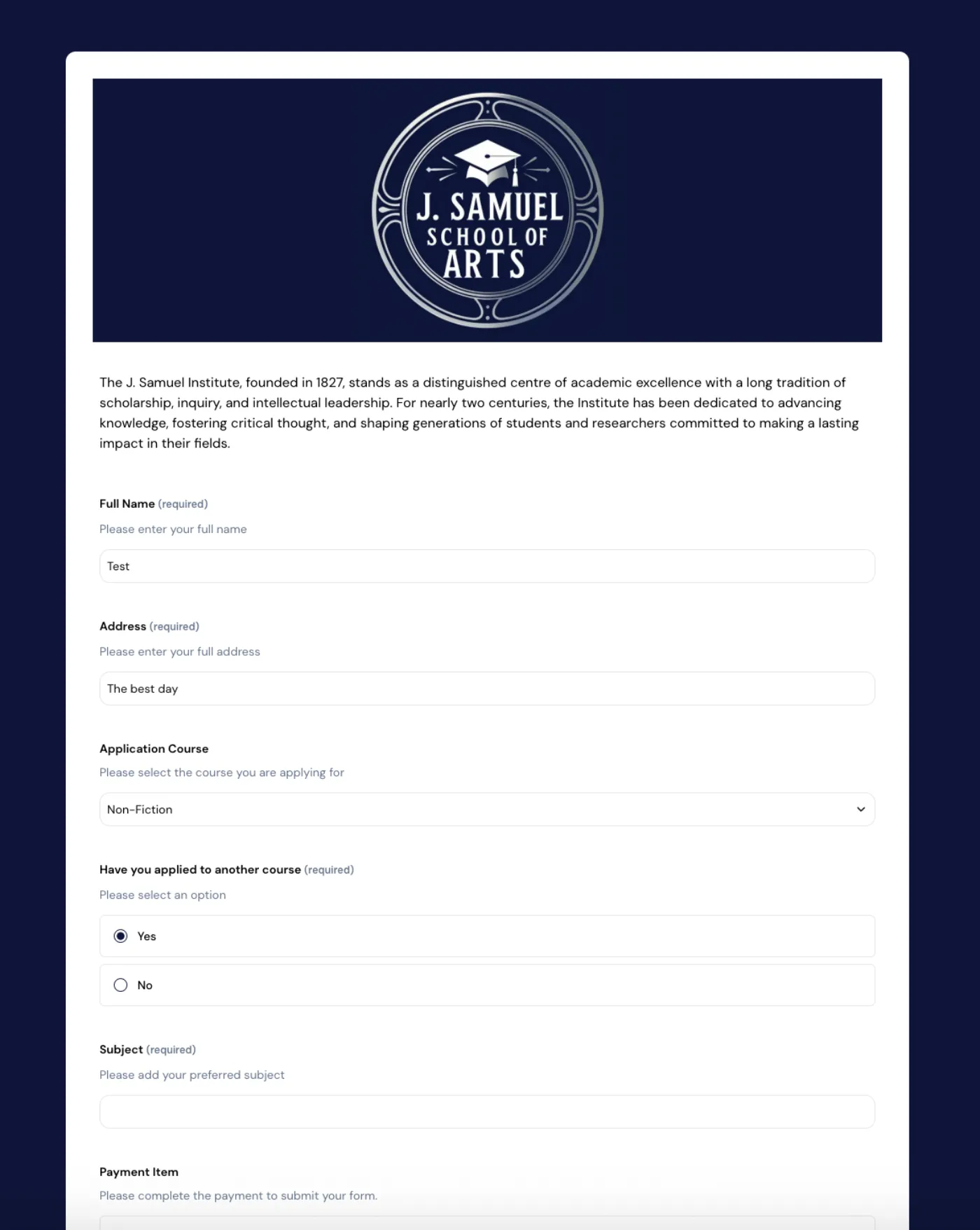
And branding isn't just about design - set the right tone. Do you want to be fun, cheeky, professional, supportive. Filling out forms isn't the most fun experience. Some find it very intimidating. Make it enjoyable. If it's in the right context, add some humour. It's no surprise that some of the highest engagement we see on forms are those that show a bit of personality.
In general, strong submission forms should include:
- Clear headers
- Custom background imagery (used tastefully)
- Cohesive colour systems
- Clean spacing
- Readable typography
- Mobile responsiveness
The form is often the only interface entrants experience before submitting their work. It should feel aligned with your programme's standards.
Presentation builds trust.
P.s Don't forget to customise the "Thank You" message. Genuinely thank the person for taking the time to send you material. It may have been a large undertaking and they may have just parted with a sizeable entrance fee. Leave them with a nice message and any extra information, next steps or impart any exciting wisdom!
7: Make Draft Saving and Return Visits Effortless
Creative submissions are rarely completed in one sitting. Make sure you use a platform that an applicant can easily return to the form to complete it at a later time or date.
Applicants may need to:
- Edit their statement
- Re-export files
- Confirm category choices
- Seek collaborator approval
- Arrange payment
Your submission system should allow:
- Draft saving
- Easy sign-in access
- Automated draft reminders
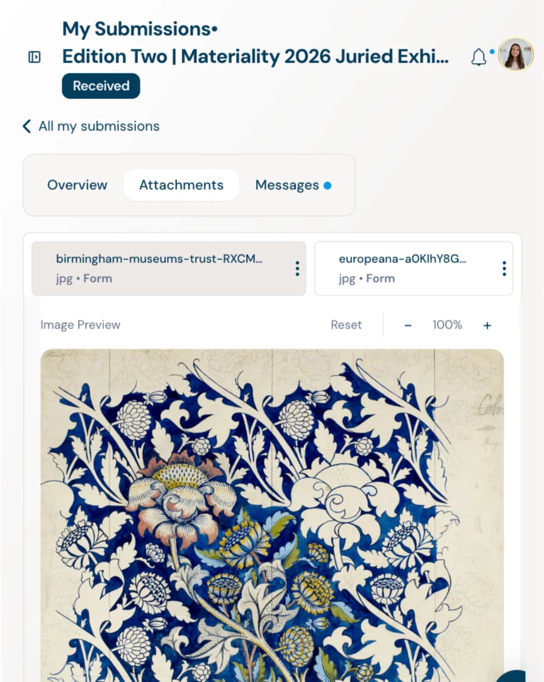
- A personal dashboard with entry history
- Downloadable attachments
- Message communication with organisers
The smoother this feels, the higher your completion rate.
And yes — reminder nudges dramatically reduce abandoned entries.
With Dapple, an applicant can create a free account in a matter of seconds and this account can then be used to return to any unfinished entries. Once a submission is completed, the applicant can then review submitted material, withdraw if needed, track the stage of their application, view any payments, send and receive messages, download attachments and add extra materials if needed.
8: Align Questions With Judging Criteria
One of the biggest structural mistakes? Collecting information judges or admin reviewers never actually use.
Before finalising your submission form, think of how each of the questions might relate to judge evaluation:
- Originality
- Craft
- Impact
- Feasibility
- Technical execution
- Relevance to theme
If a field doesn't help assess these, reconsider it.
Judges should not be reading 2,000 words to extract three scoreable insights. Well-designed forms guide applicants toward relevant, evaluable information.
Clear prompts lead to fairer judging.
It's also very important to make sure that judges see the correct fields. Use hidden fields and conditional visibility to remove identifying information (like name, gender, institution or location) from reviewer view during blind judging — it reduces unconscious bias, protects fairness, and ensures work is assessed purely on merit rather than reputation or background.
9: Build for Admin, Not Just Entrants
Your form feeds your entire review workflow.
Think ahead:
- Will submissions be filtered by category?
- Do judging panels need segmentation?
- Can you tag entries?
- Are uploads labelled clearly?
- Does the metadata support reporting?
Clean form structure simplifies:
- Reviewer assignment
- Status tracking
- Communication
- Analytics
- Long-term archive access
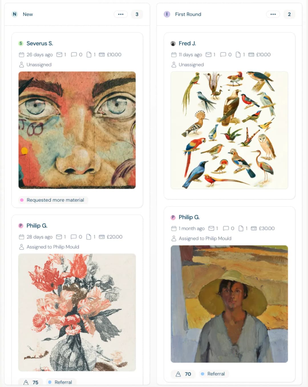
Within Dapple, you can create multiple projects, create different stage based rules, automations, tag, filter and assign different review panels to different projects and stages.
Front-end clarity reduces back-end chaos.
10: Transparency Builds Longevity
Submission forms are also legal documents.
Be explicit about:
- Rights usage
- Reproduction permissions
- AI policy
- Refund policy
- Data handling
Avoid hidden fees or unclear declarations at the final step. That's where trust can collapse.
Creative entrants are "customers" yes but in many ways they are so much more than that. They are submitting work they may have spent months refining.
Respect is visible in the details.
Conclusion
The quality of submissions you receive is directly influenced by the quality of the submission experience you create.
Design better forms → receive better work.
Respect creators → attract serious creators.
Remove friction → increase completion.
Before you close this guide, please confirm the following:
Build forms that feel thoughtful.
Build processes that feel fair.
Build experiences that people would willingly complete again.
Then press publish with confidence.
"Dapple forms are awesome. Easy to set up, customize and brand and they don't look like those old application system forms we're used to! Our conversion rate has improved as a result."
— Robert S, Programme Manager
Explore More
A Beginner's Guide to Managing Awards
A comprehensive playbook for launching fair, credible, and scalable awards.
How to Set Entry Fees for Creative Awards
Set competitive, fair, and sustainable entry fees for your creative awards and contests.
How to Run an Open Call for Artists
Step-by-step guide to planning, launching, and reviewing an open call.